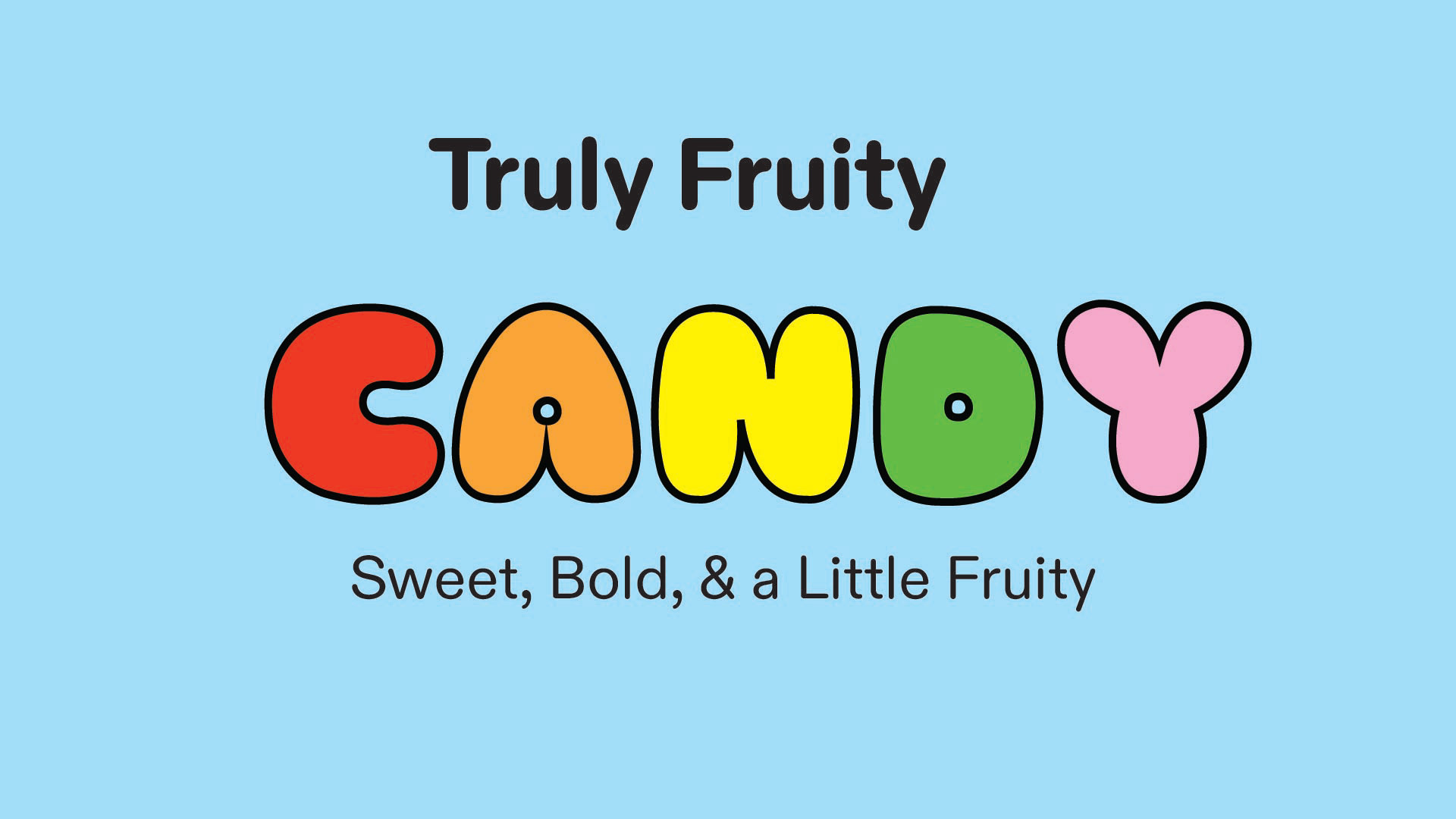
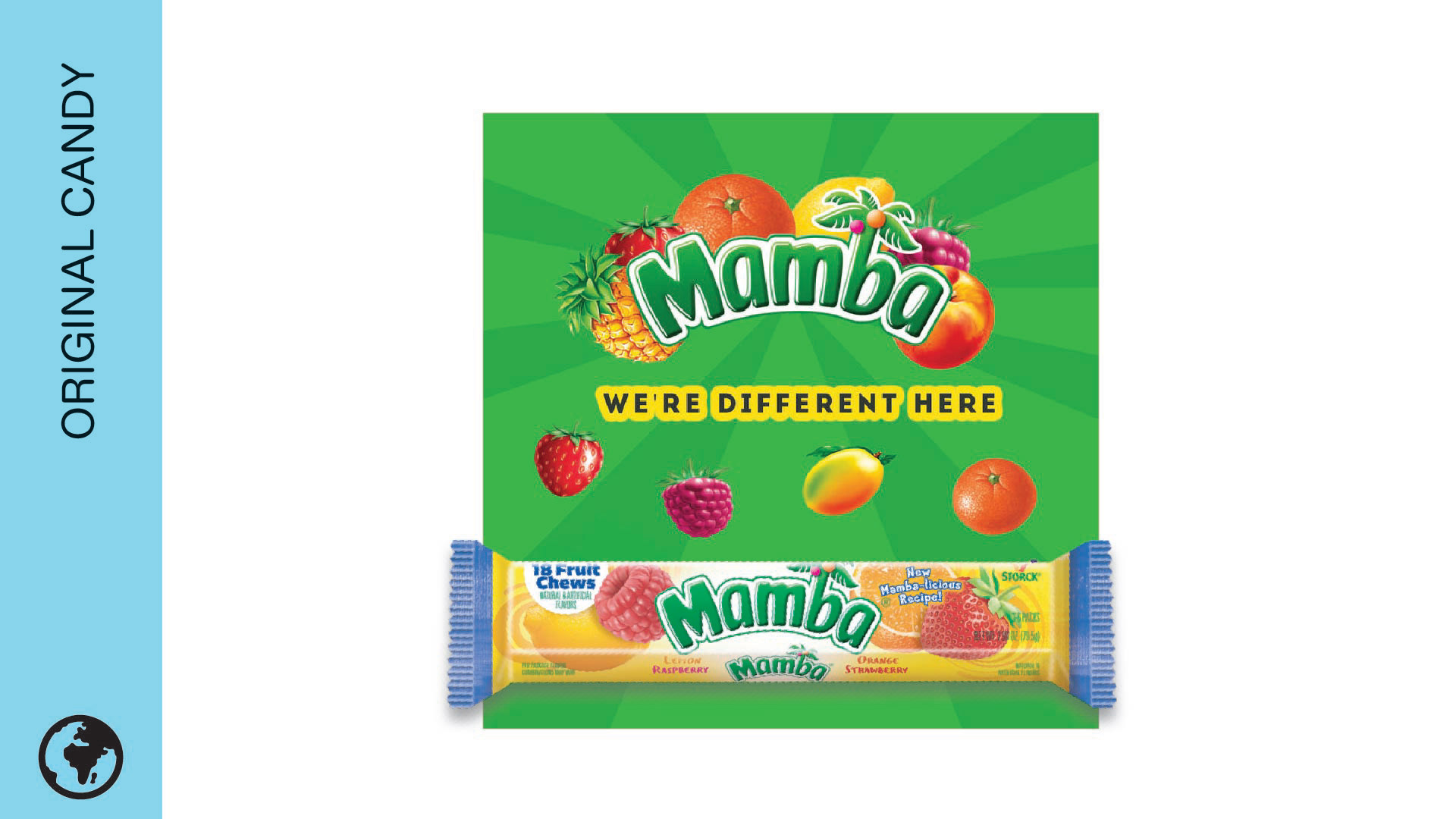
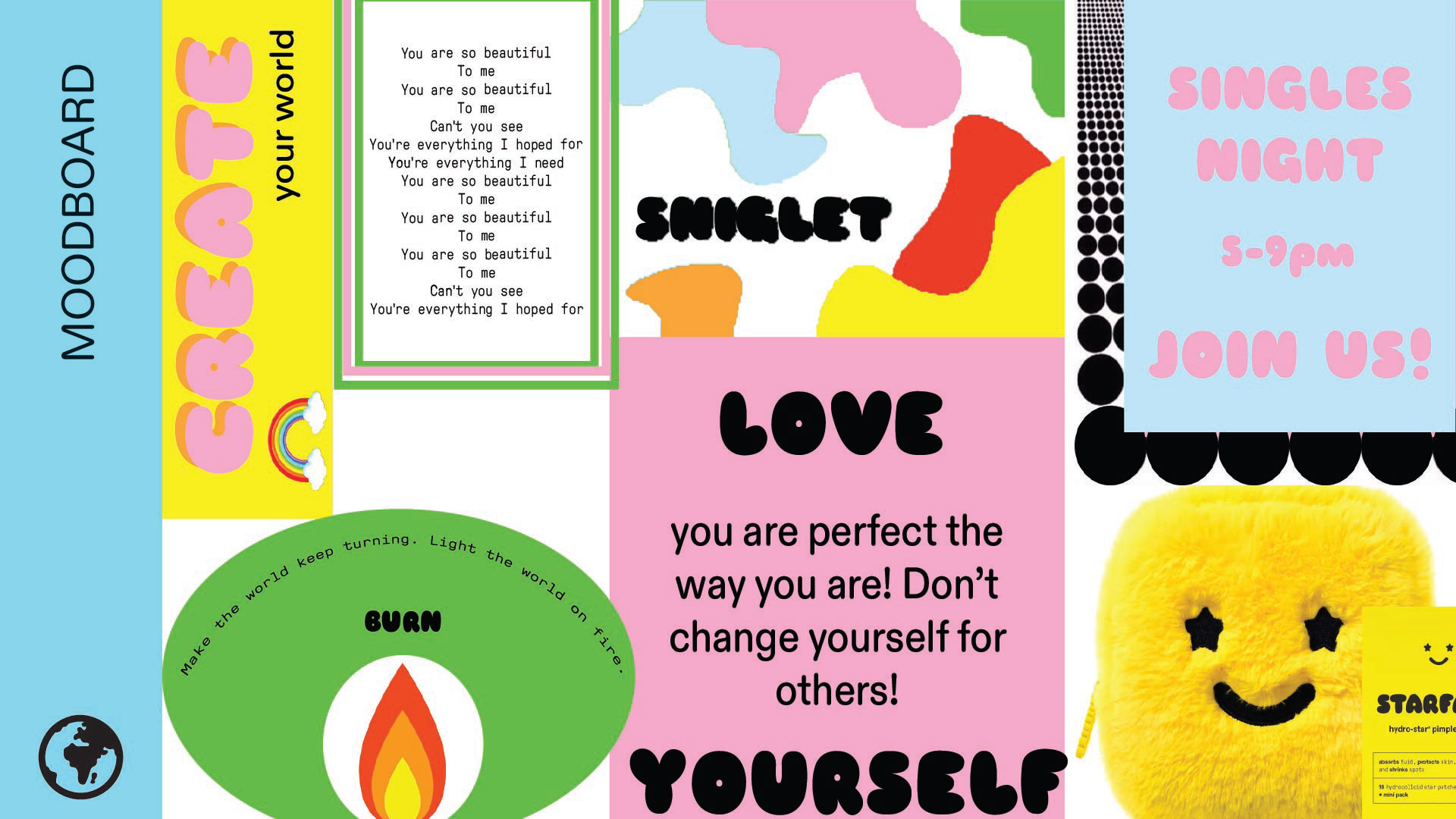
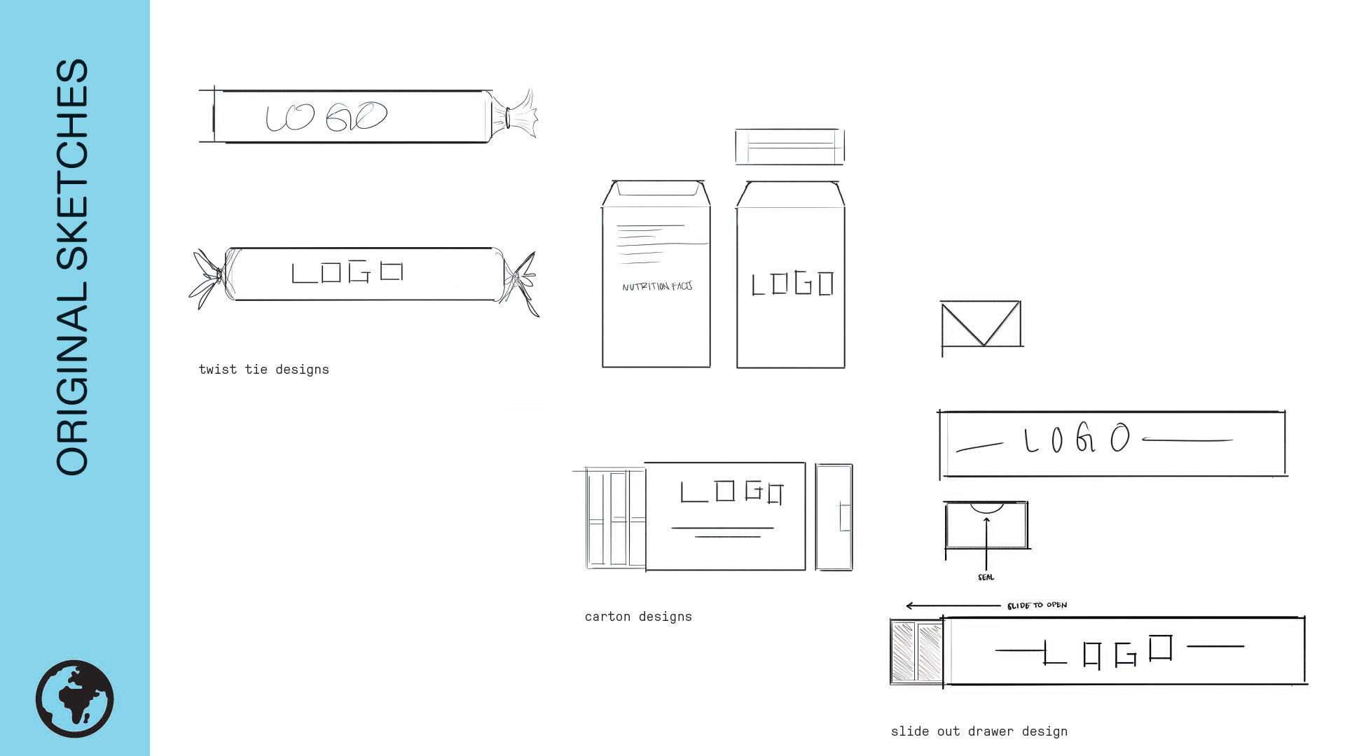
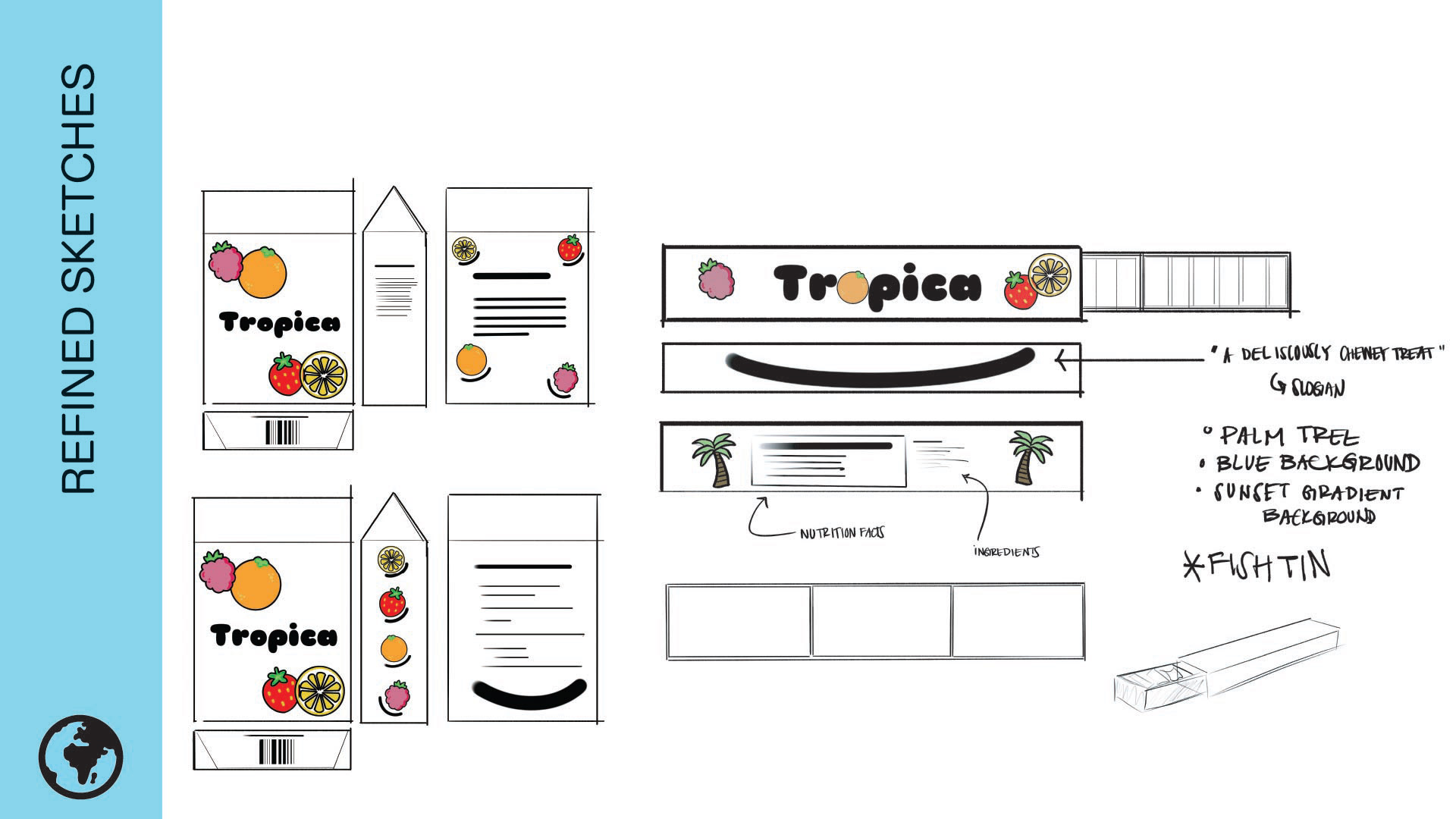
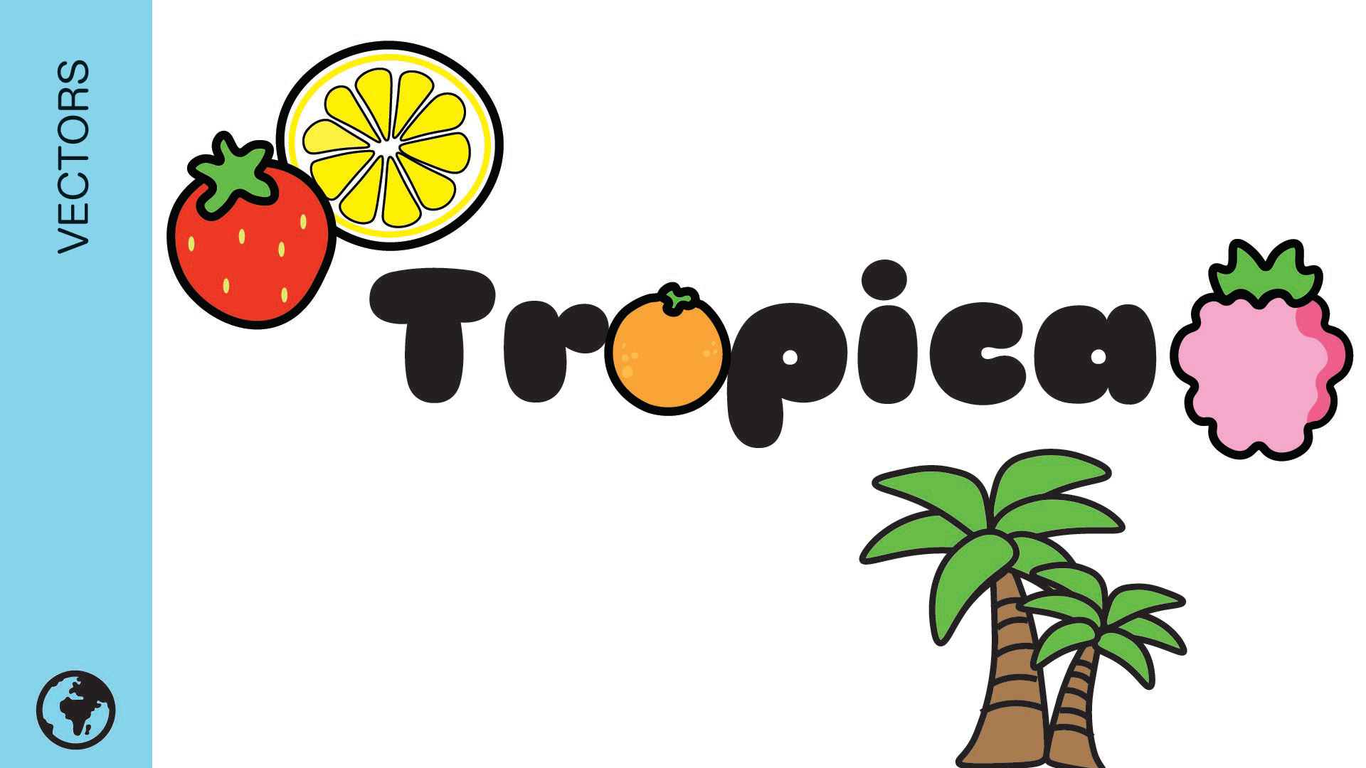
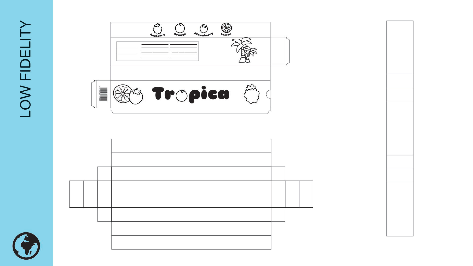
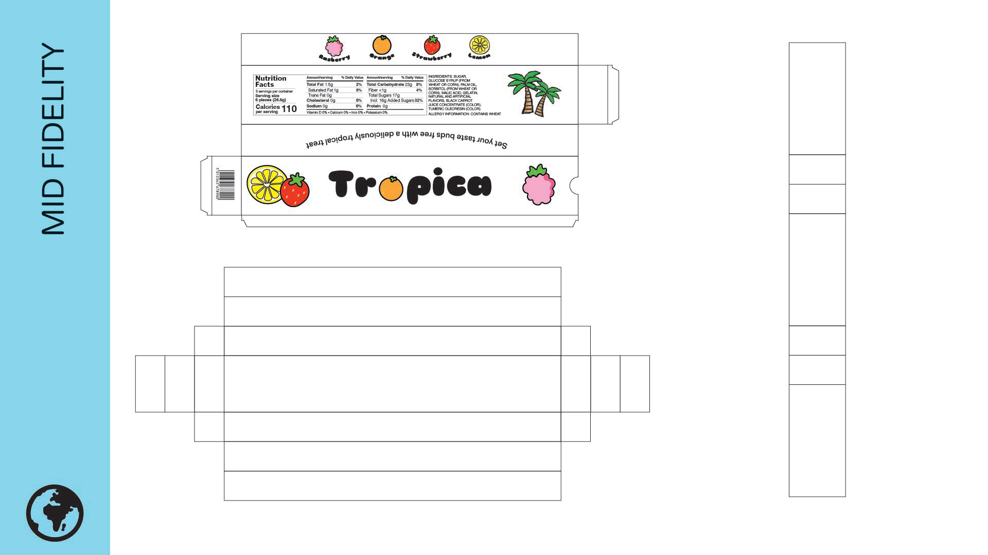
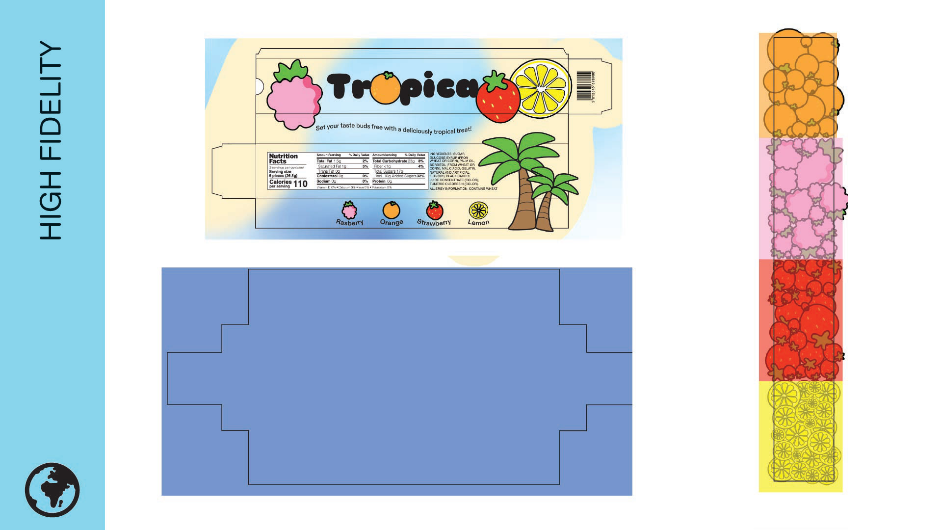

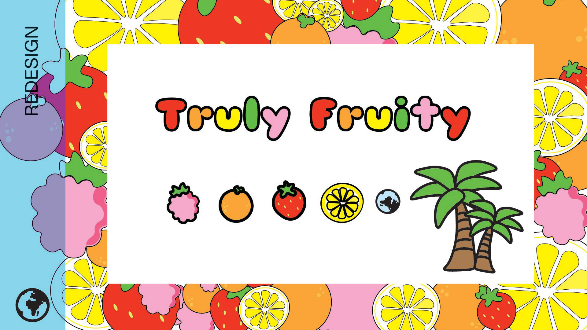
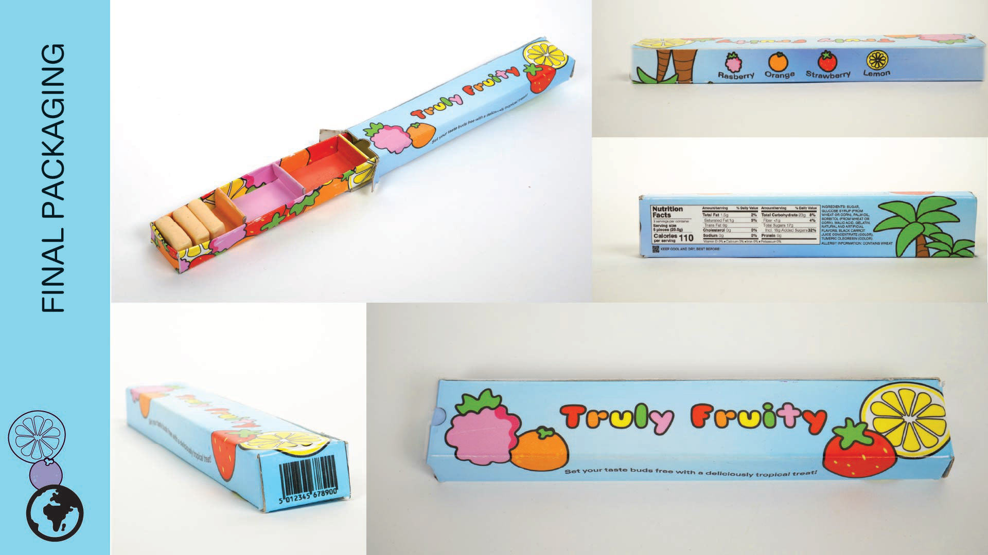
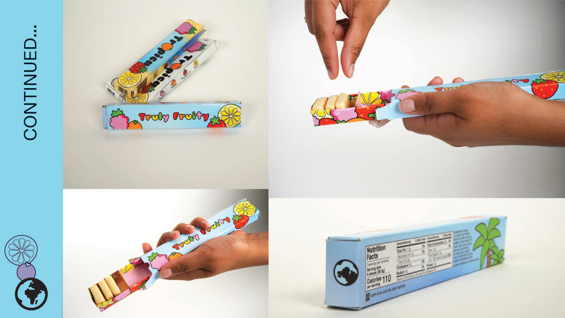
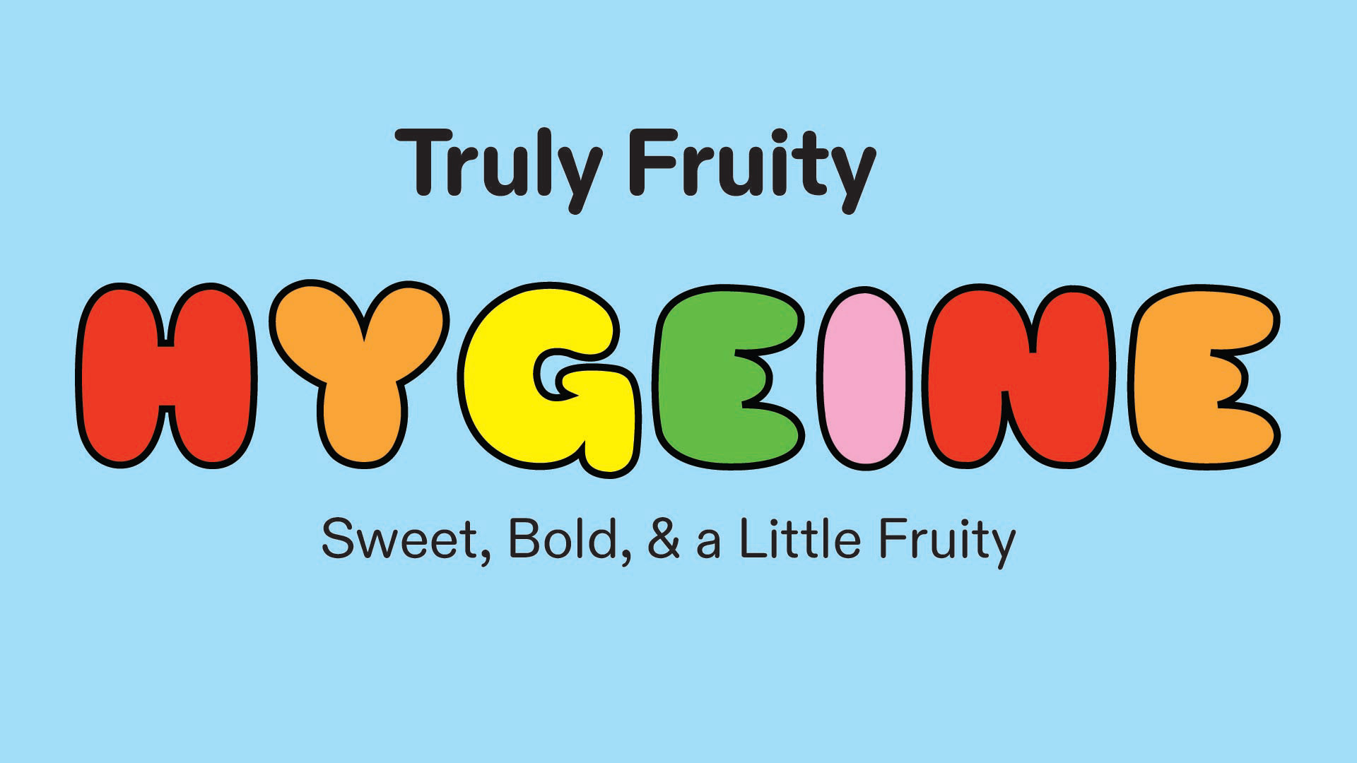
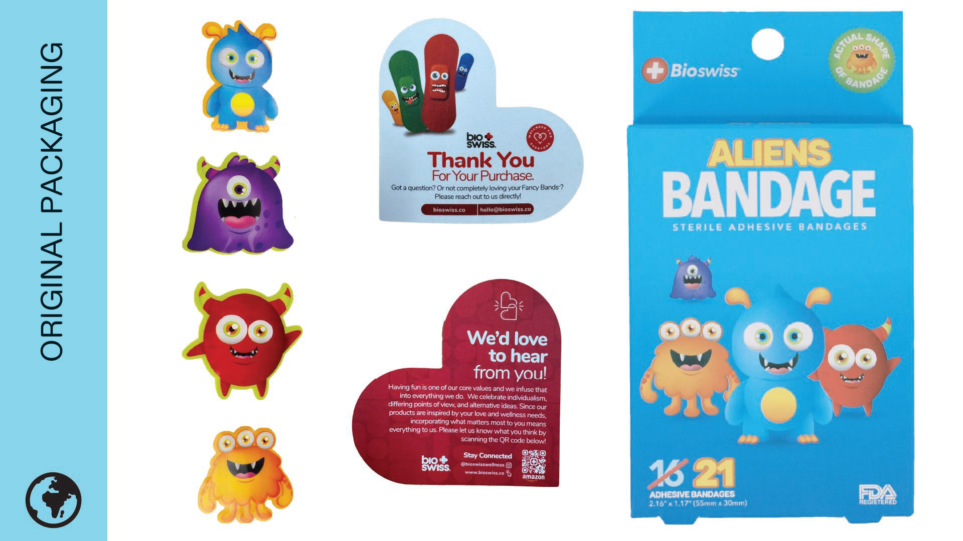
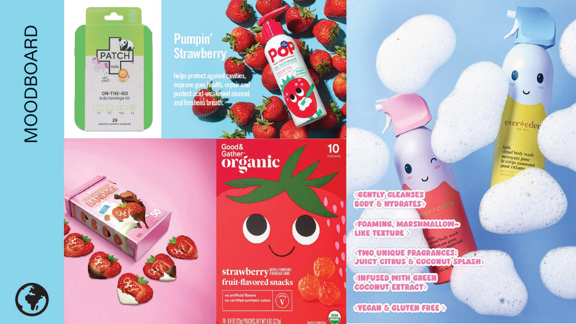
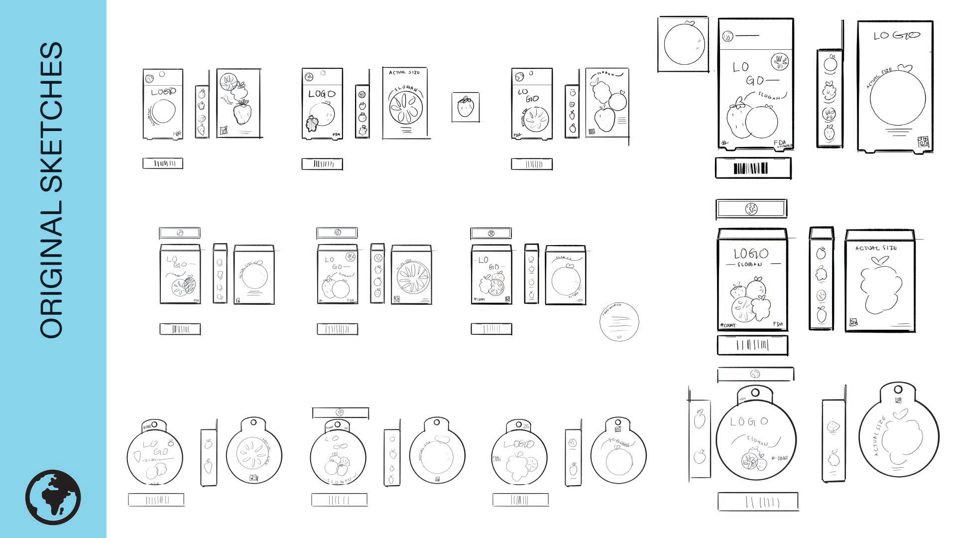
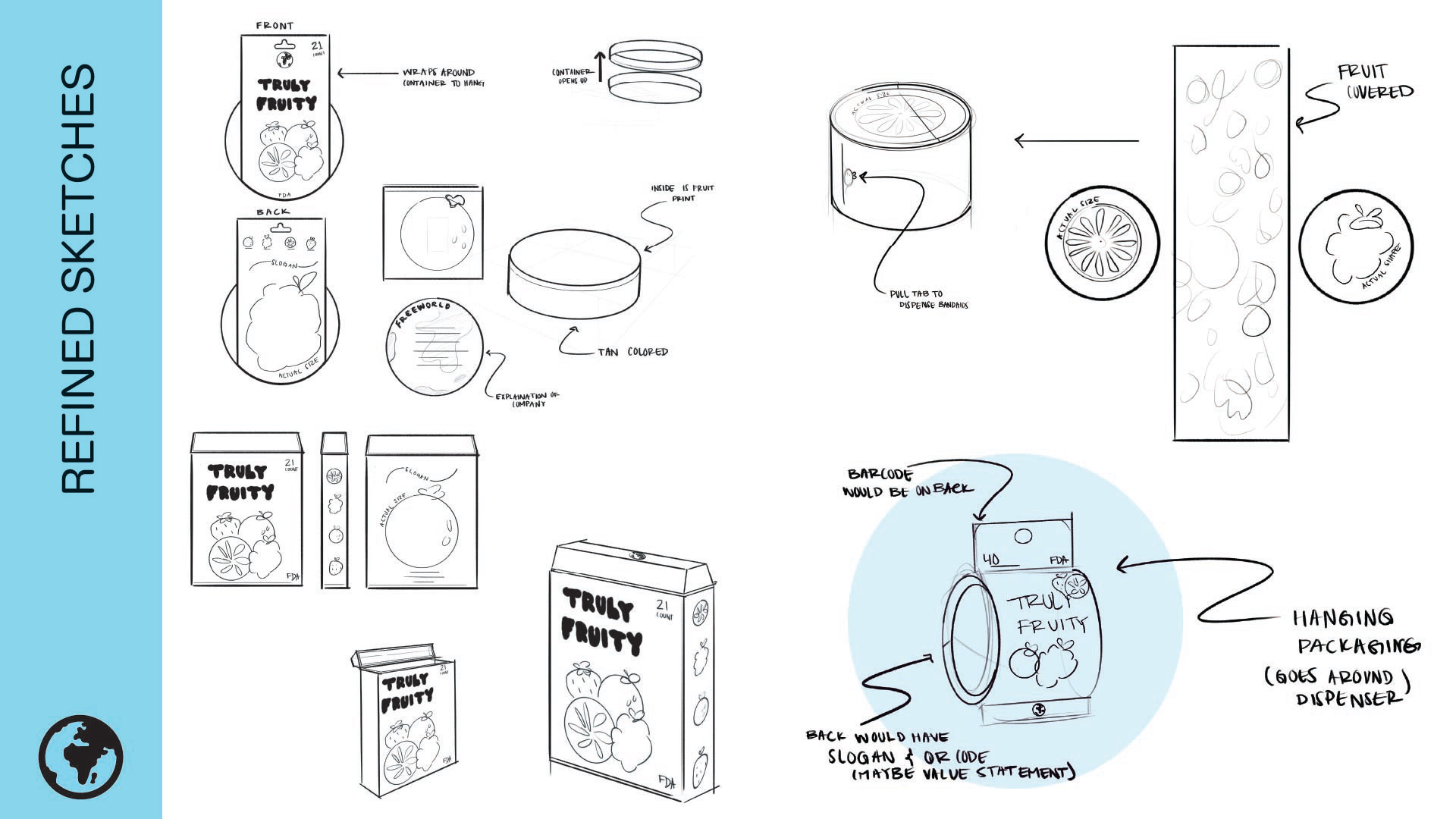
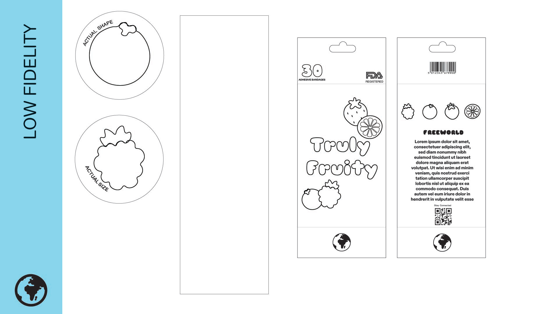
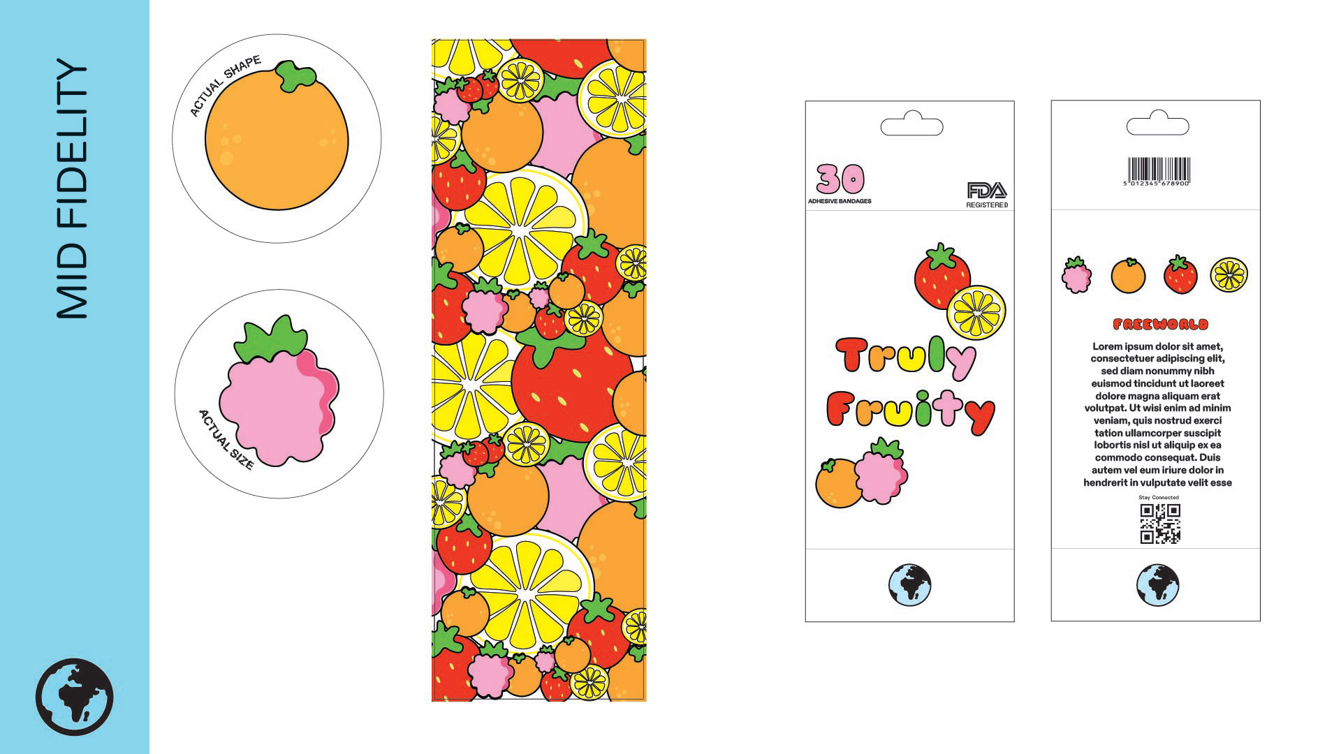
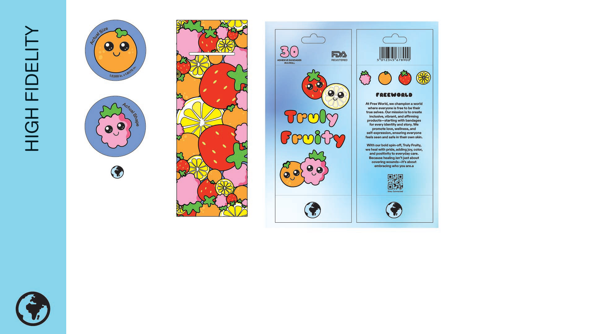
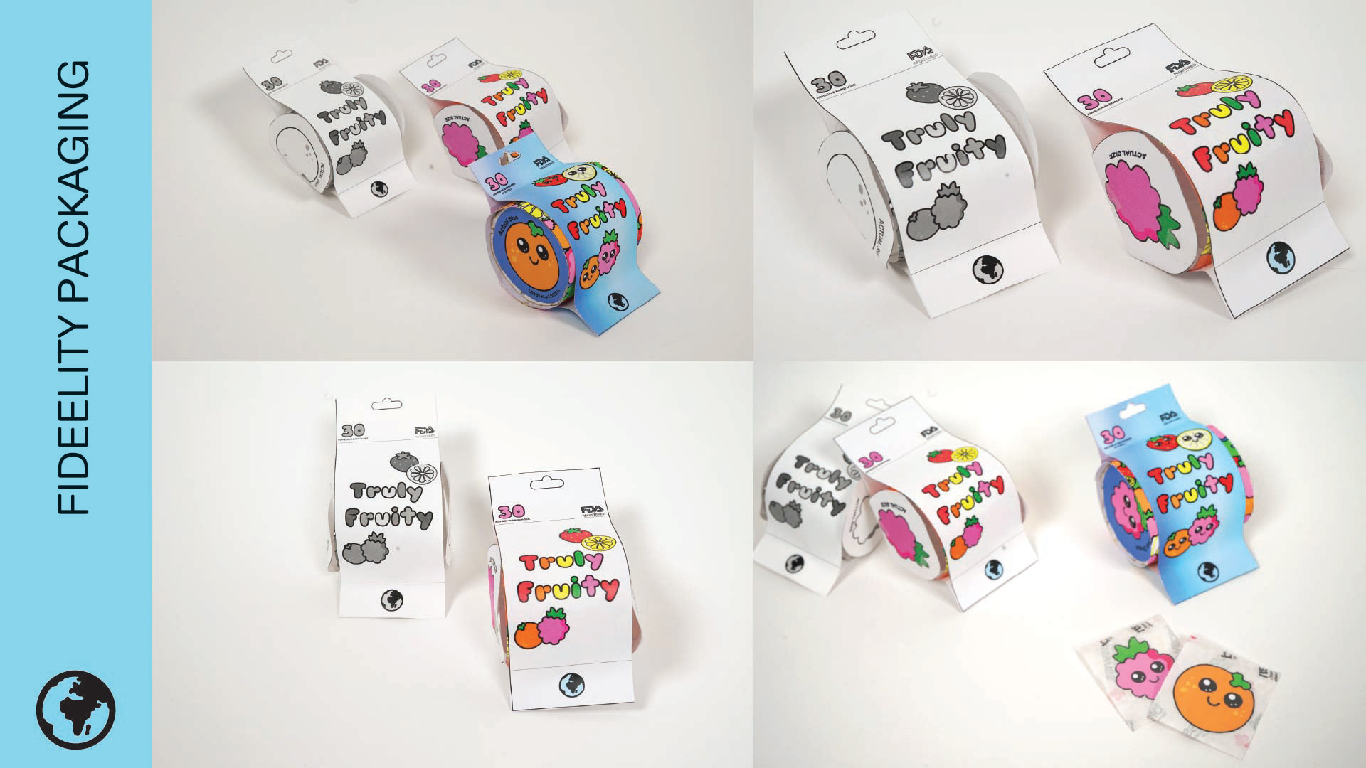
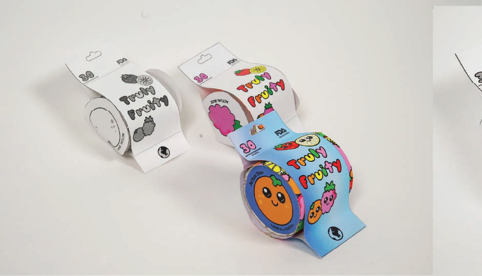
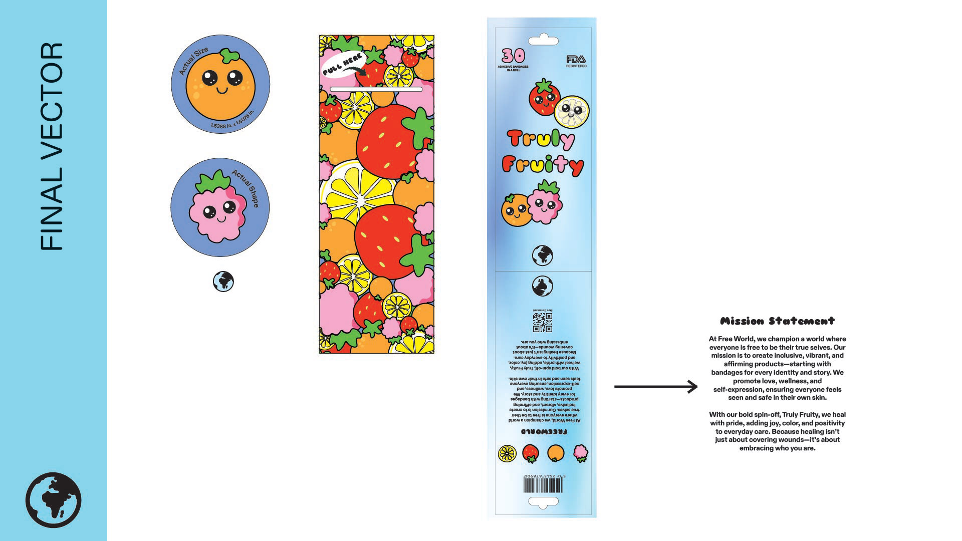
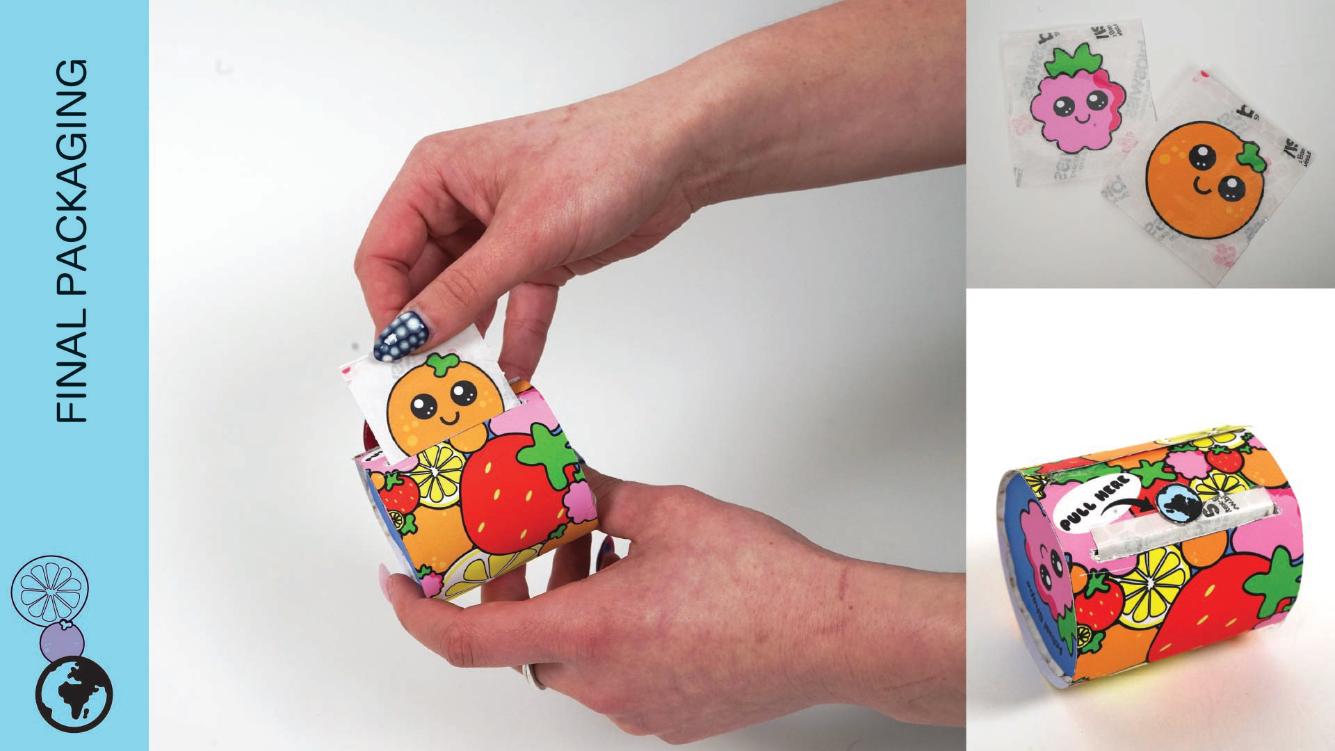
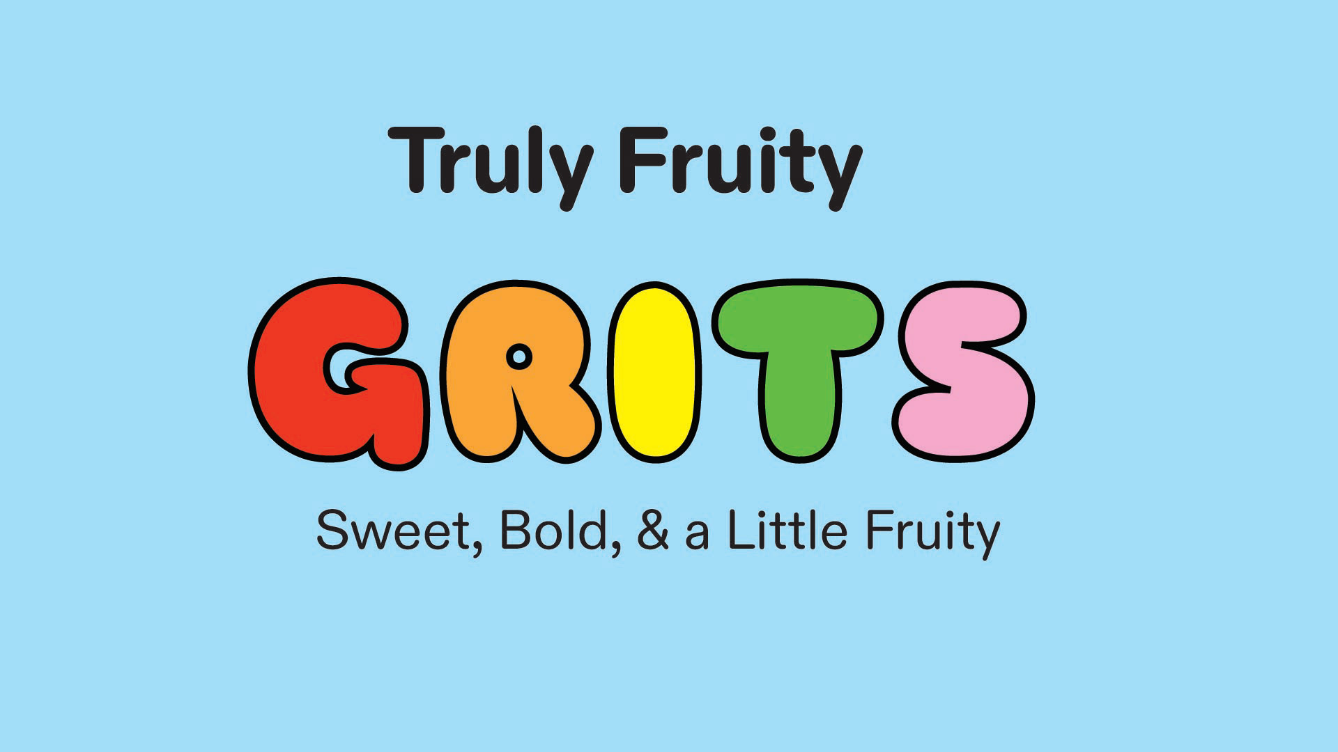
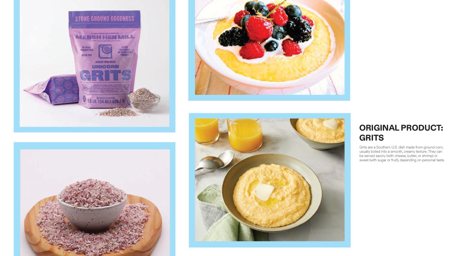
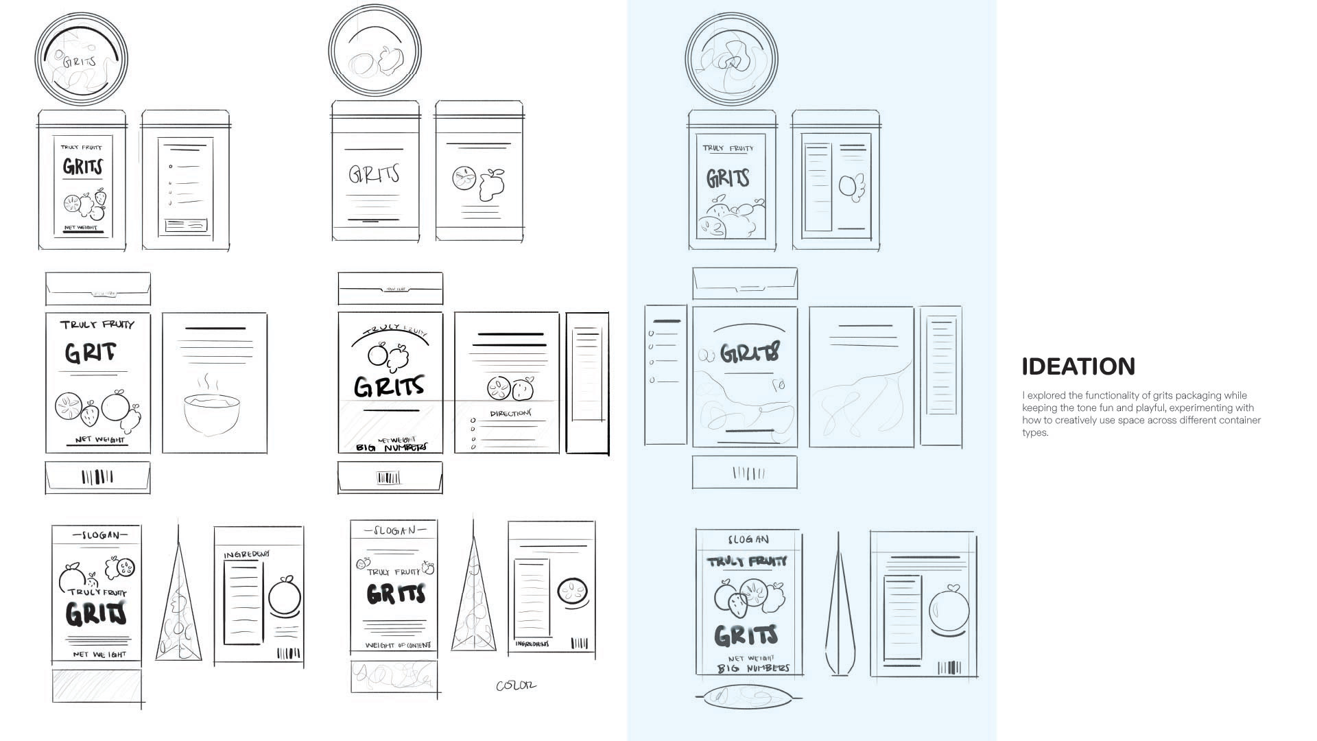

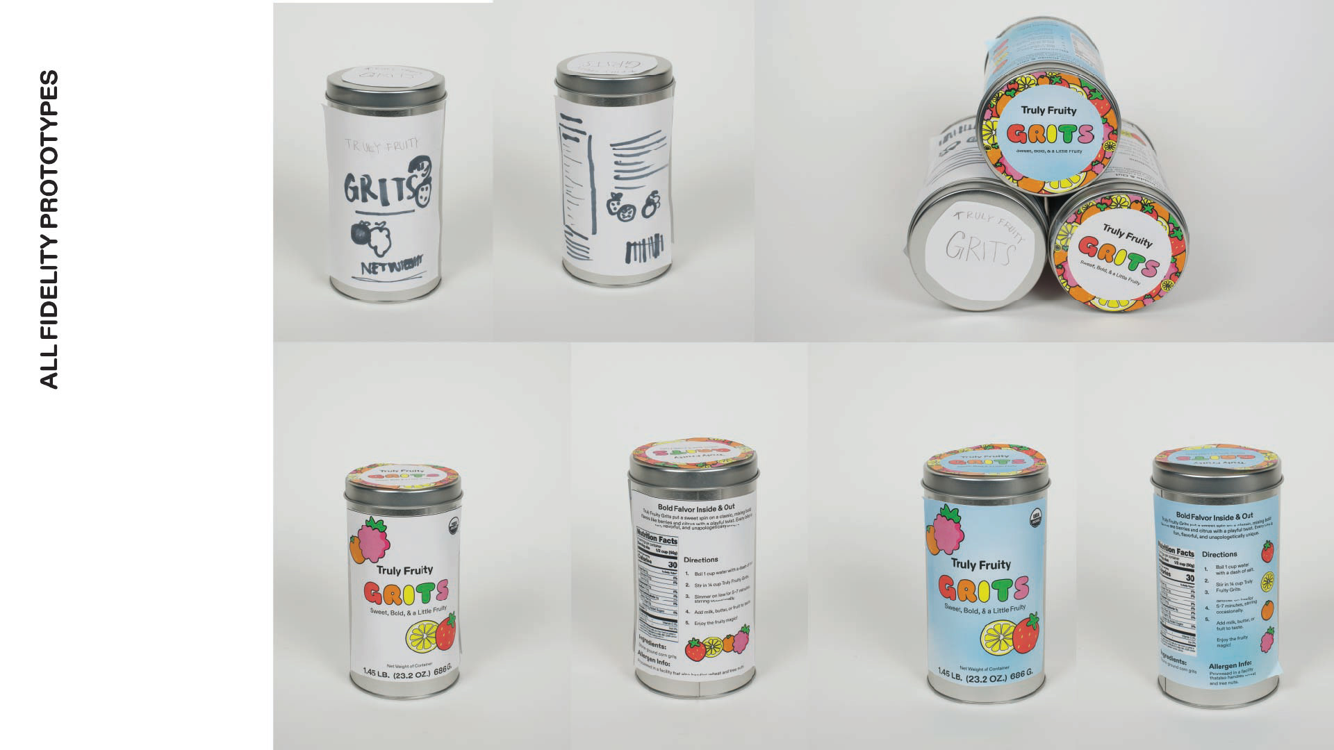
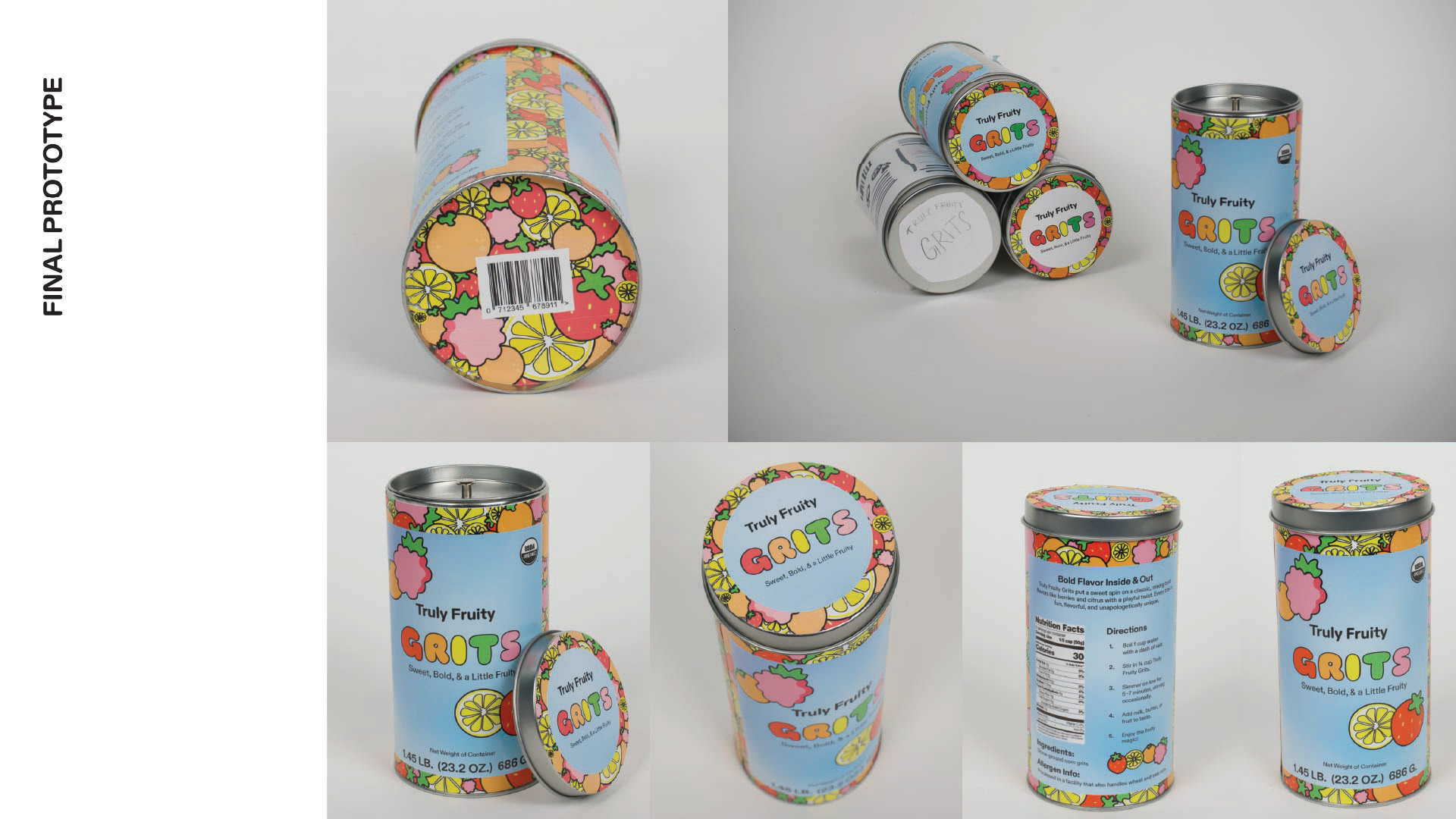
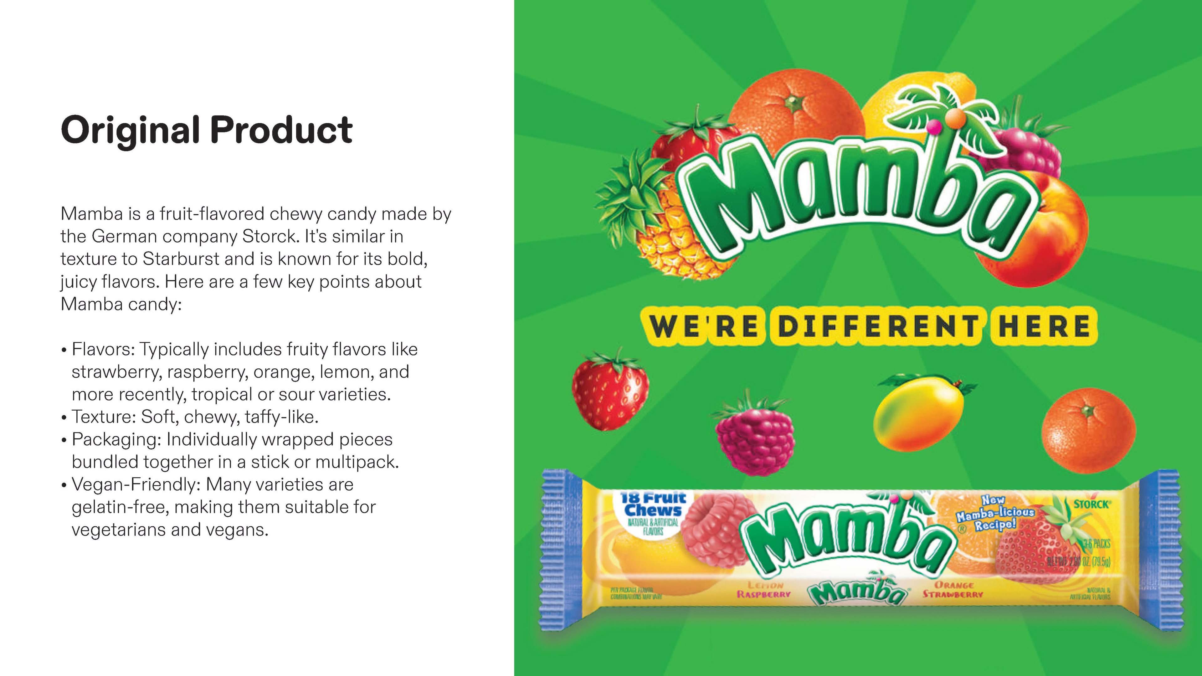
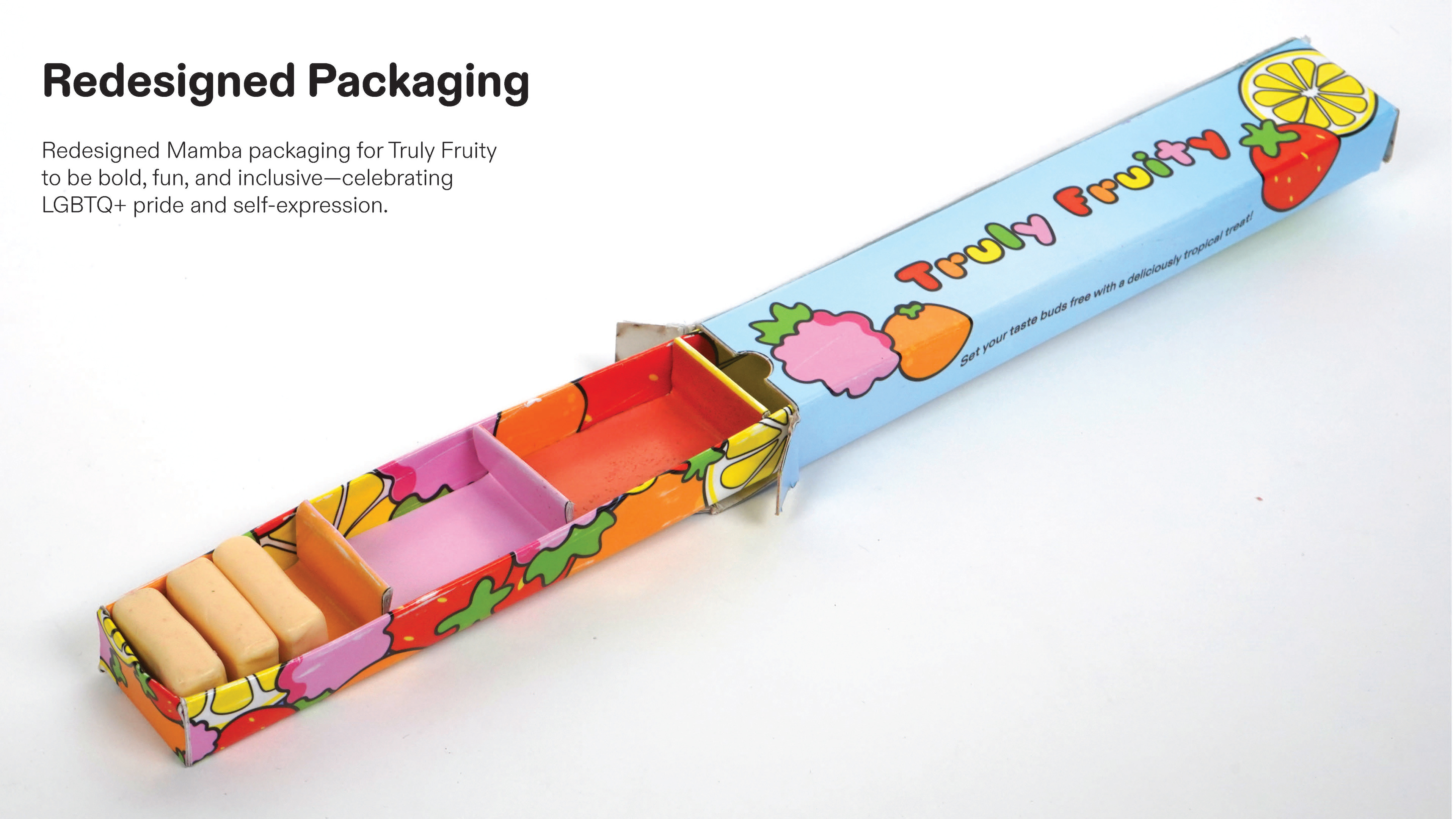
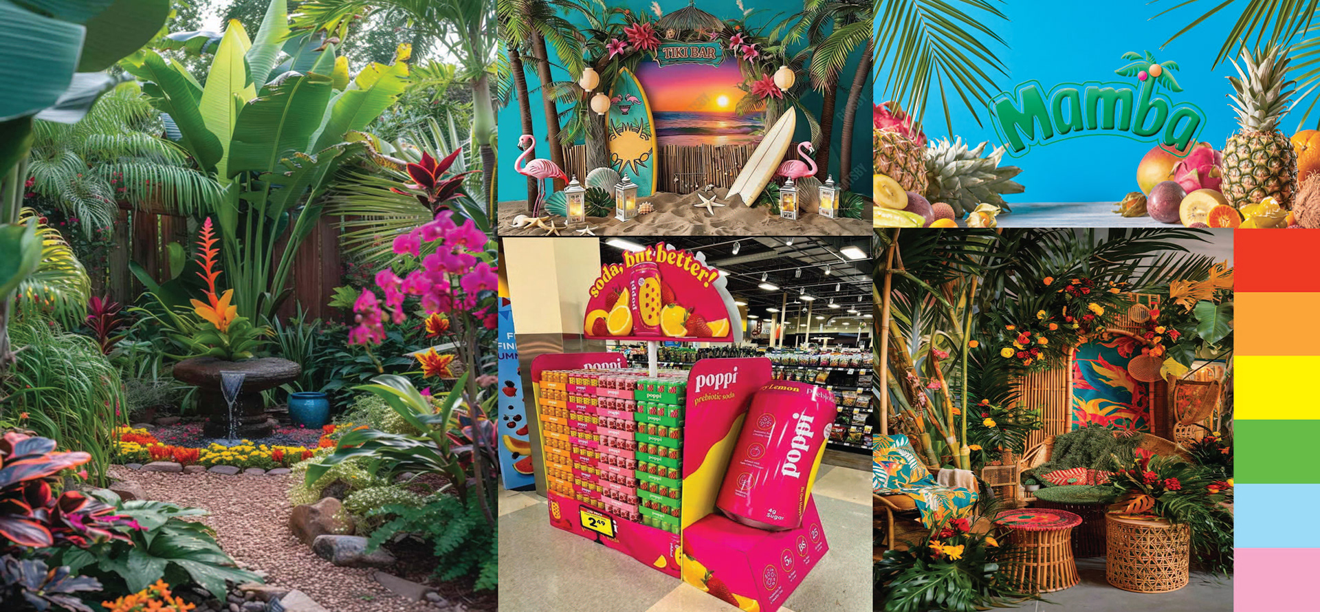
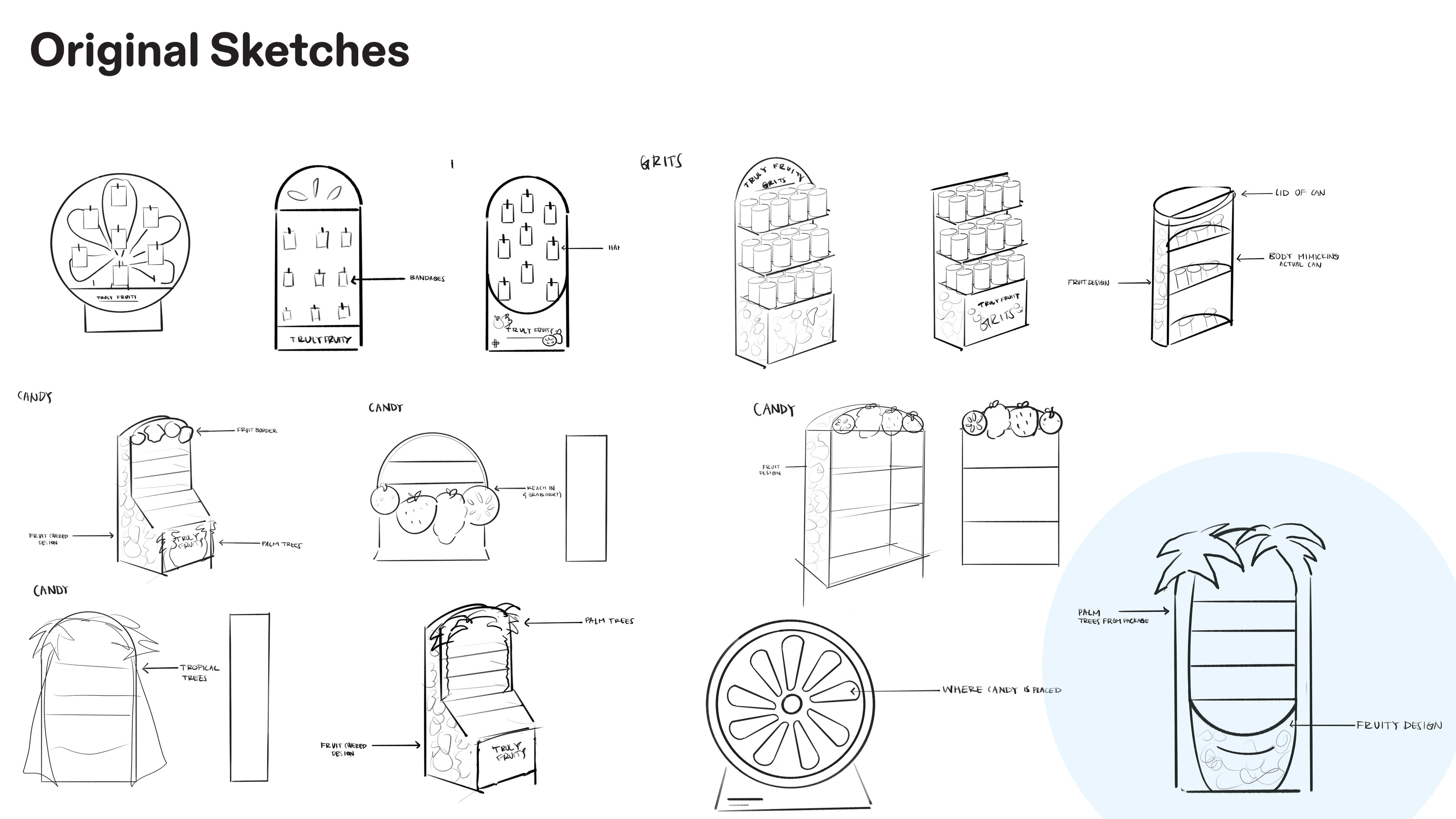
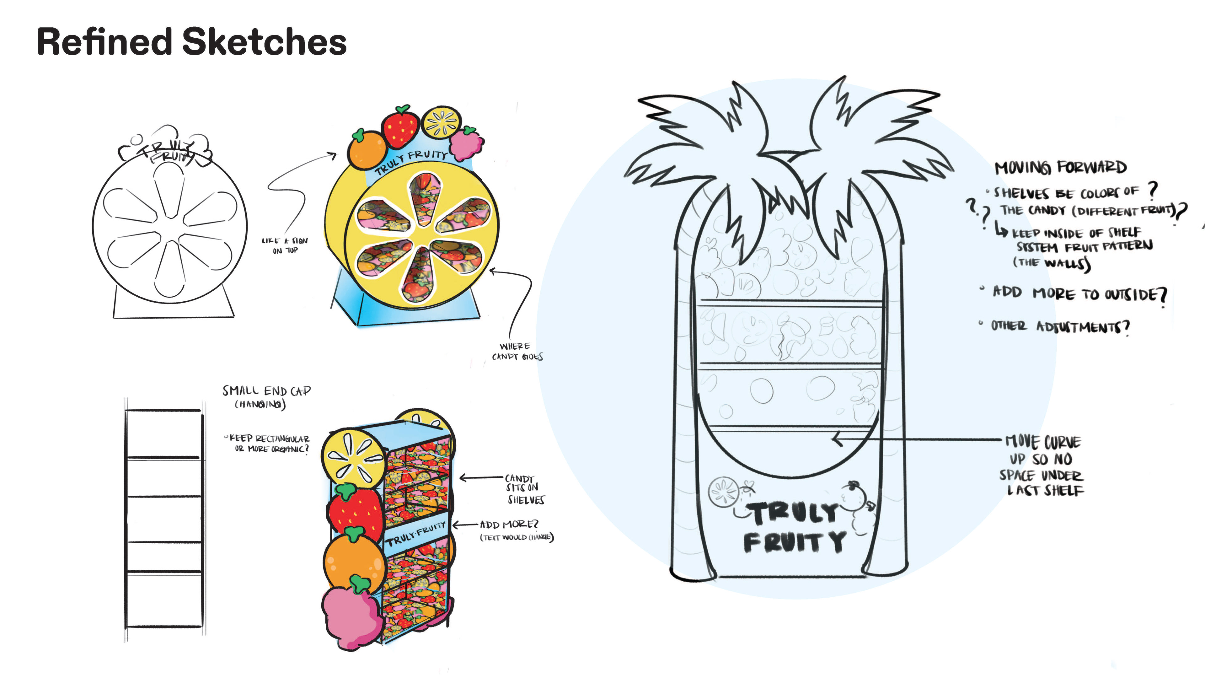
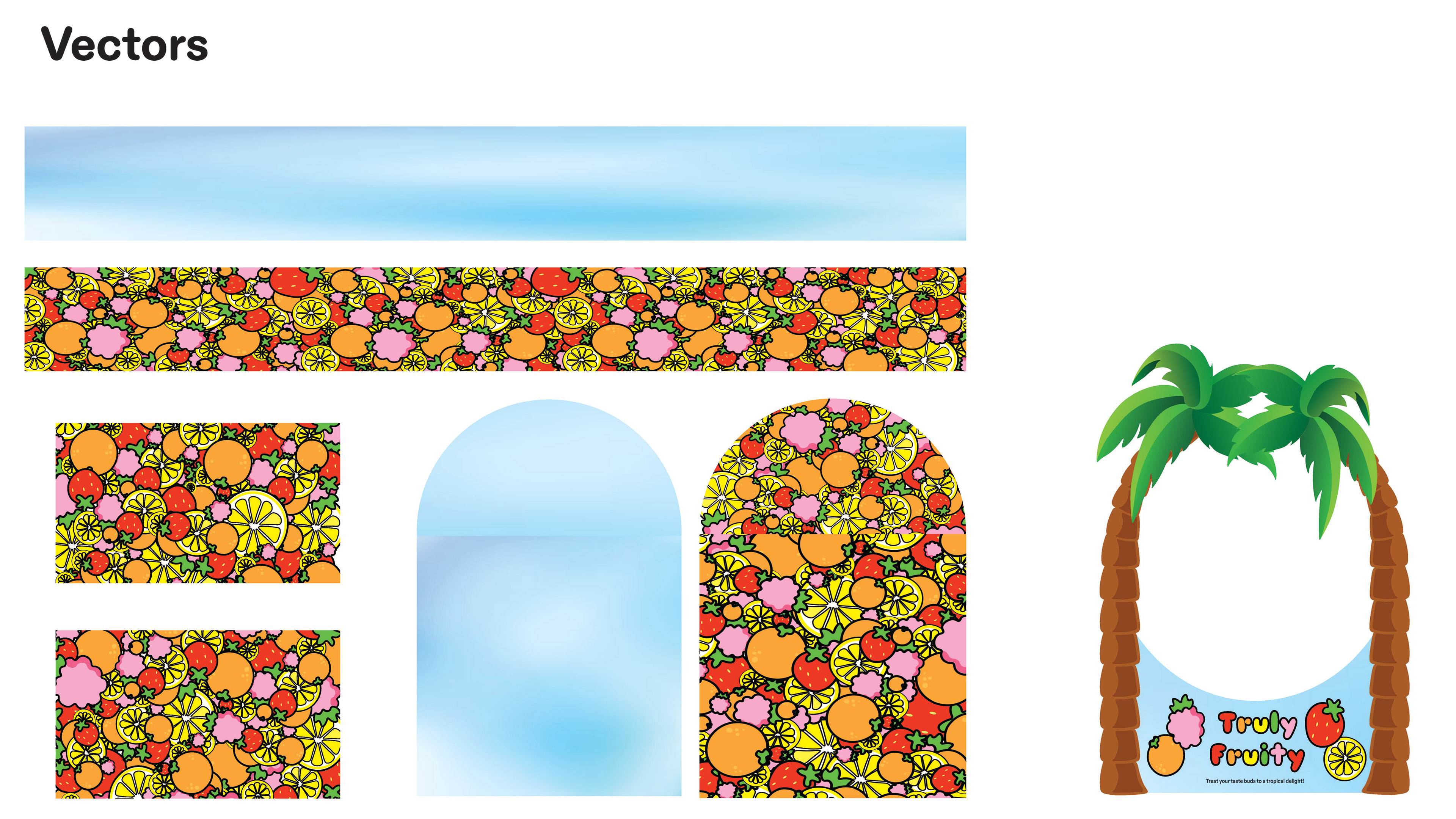
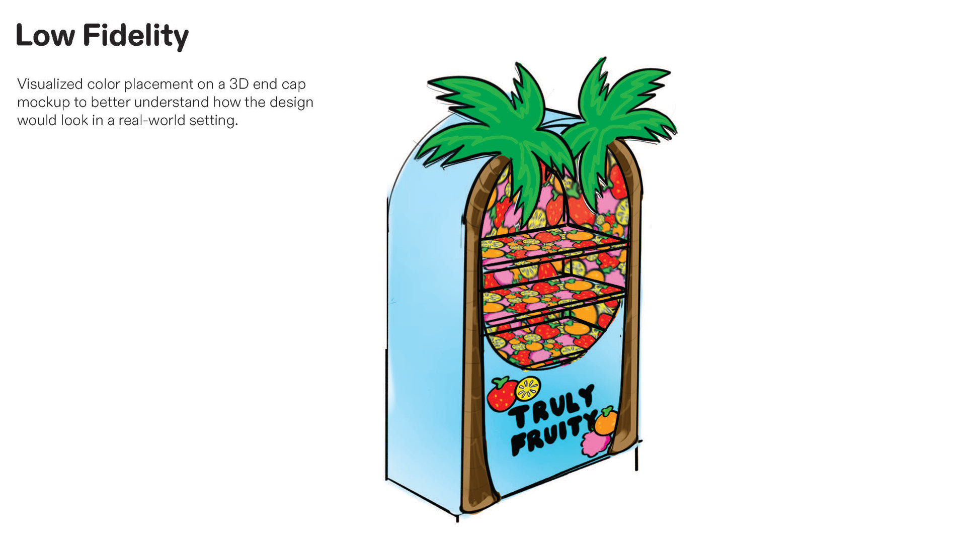
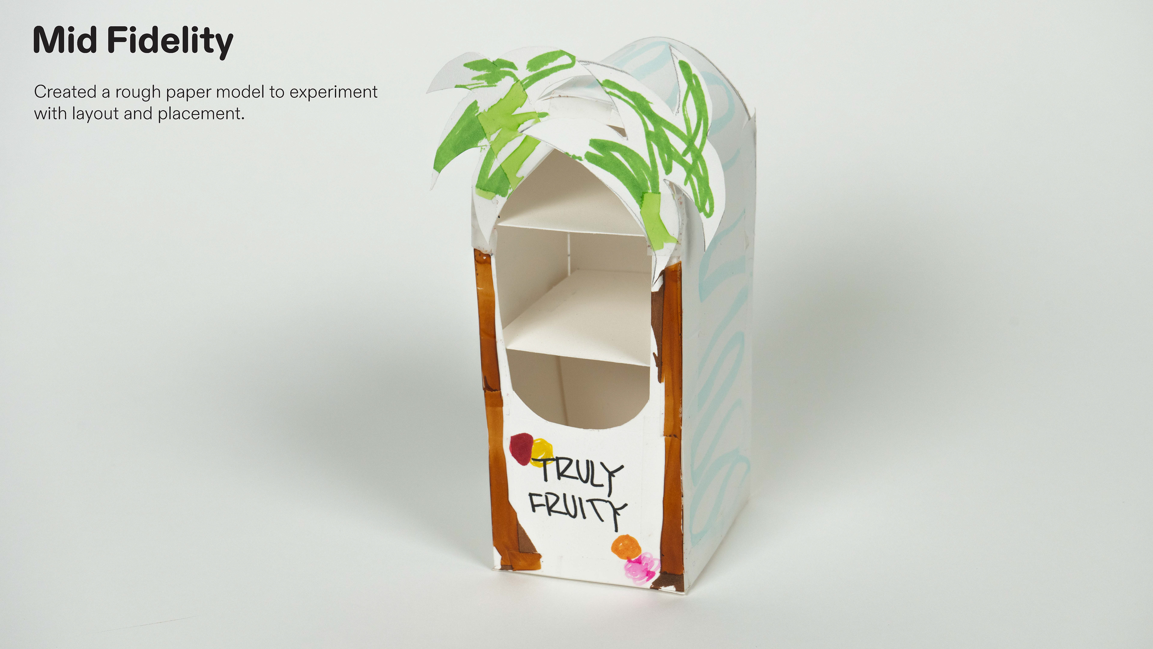
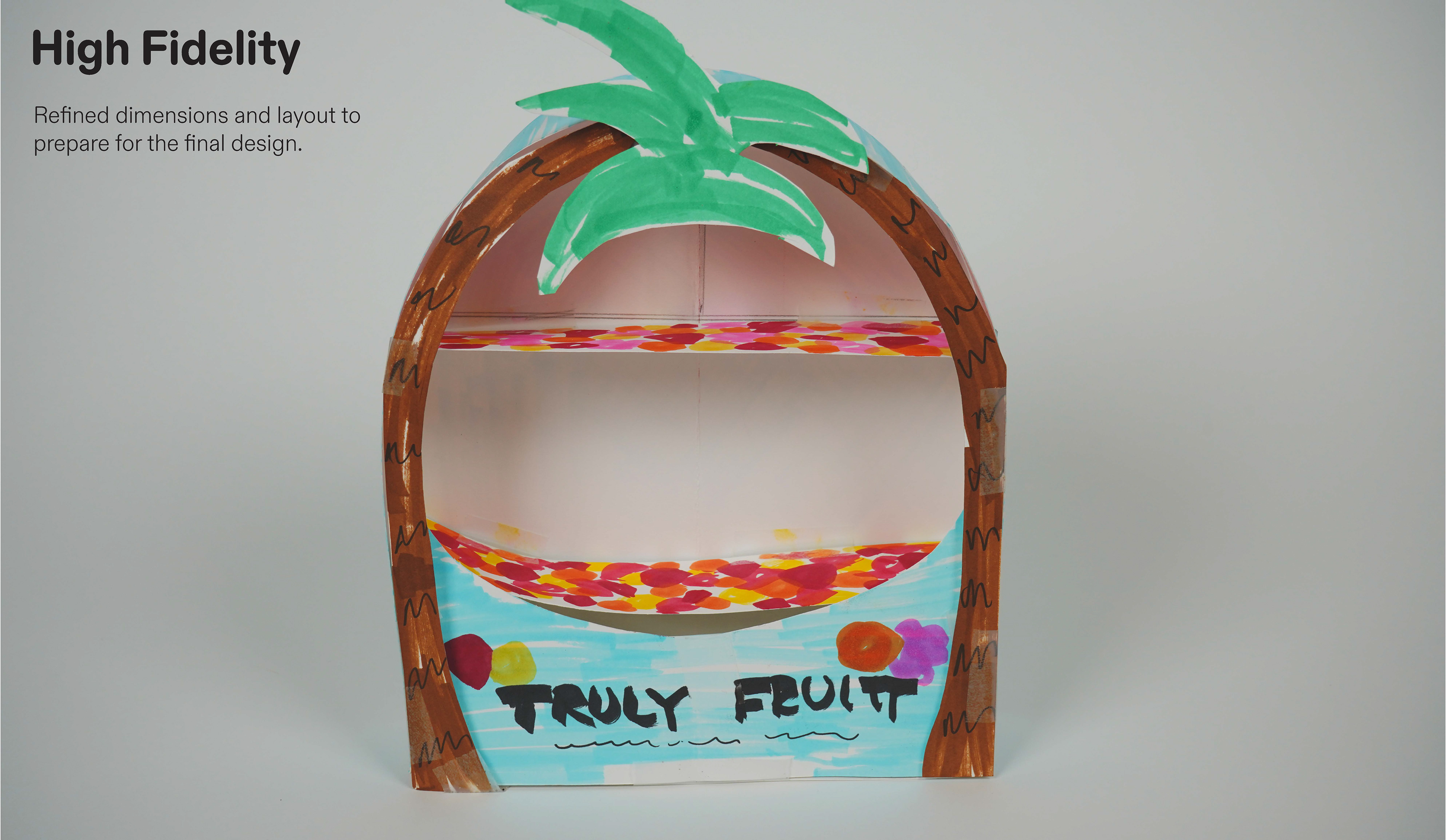
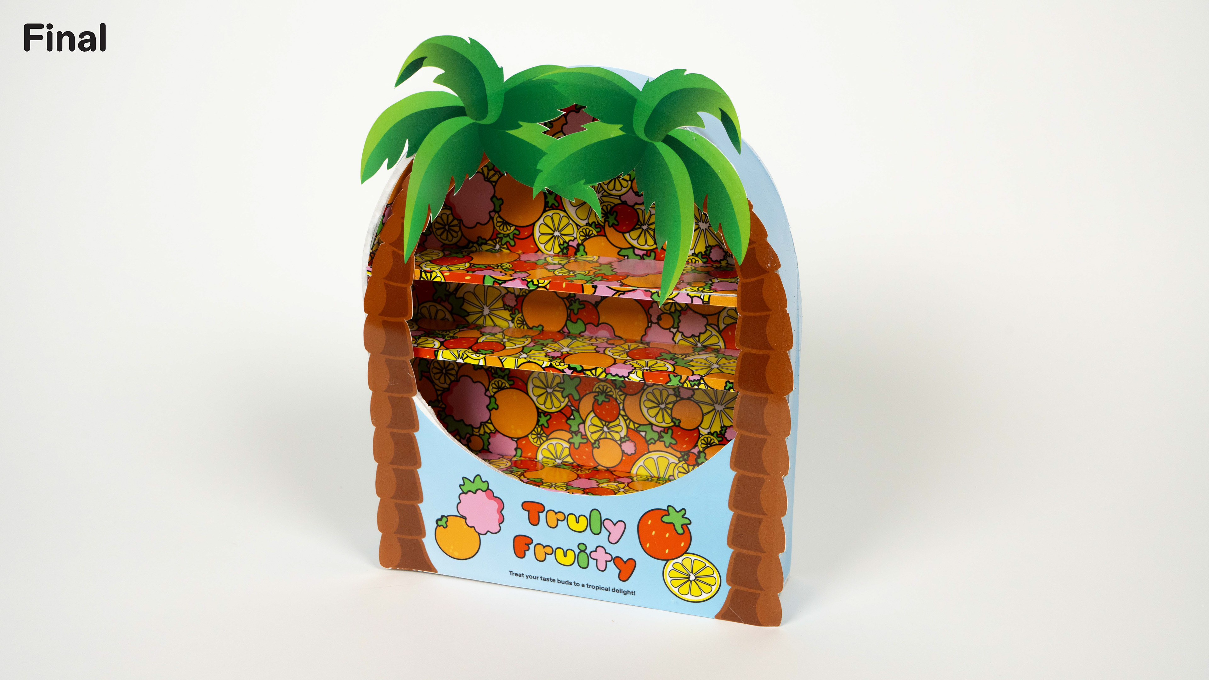
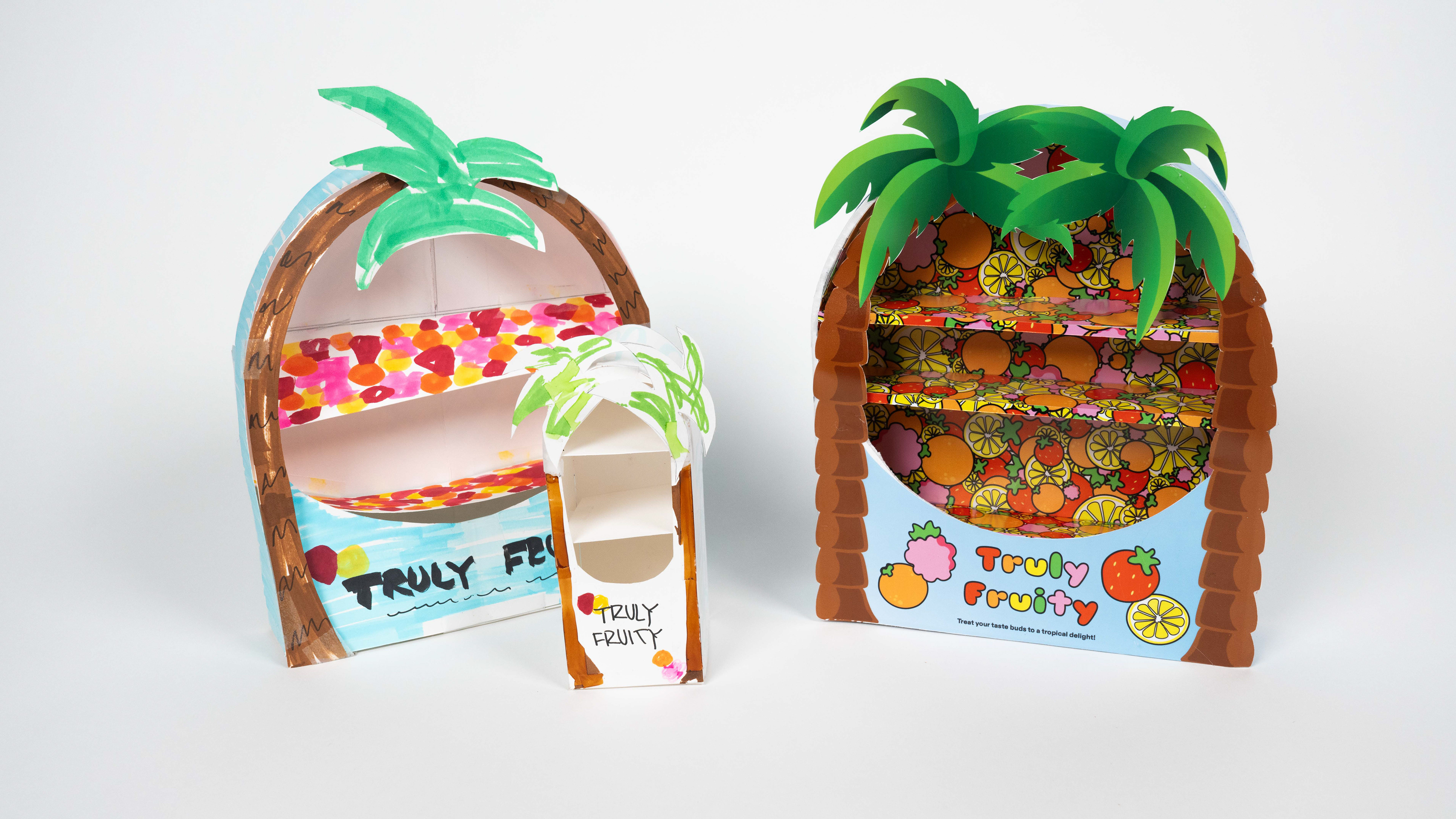
Overview: For this semester-long packaging design project, we were challenged to develop a “liberated dupe brand”—a concept focused on redefining products through the lens of liberation. For me, liberation meant visibility, self-expression, and advocacy for the LGBTQ+ community. This inspired the creation of Truly Fruity, a playful, proudly queer brand that celebrates individuality, sustainability, and joy in everyday objects. Brand Concept: Truly Fruity Truly Fruity reclaims the term "fruity" as a badge of pride and expression. It’s bold, cheeky, and unafraid to stand out—just like the community it celebrates. The brand brings liberation to consumer goods by centering queer identity, vibrant self-expression, and sustainable values. Packaging Redesigns: Throughout the semester, I applied the Truly Fruity brand system to three product categories: Candy – Reimagined with unapologetic color, quirky copywriting, and inclusive messaging. Hygiene Product – Designed to feel gender-free, body-positive, and affirming in both form and function. Breakfast Food – Created to spark joy and self-love first thing in the morning, with bright, bold packaging and playful illustrations. Each design reflected core brand values: visibility, joy, rebellion against heteronormative and unsustainable standards, and a commitment to accessibility and inclusion. Retail Expansion: End Cap Design As a final deliverable, we were tasked with designing an end cap display to showcase our brand in a retail environment. I created an immersive, eye-catching display for Truly Fruity that reinforced the brand’s bold identity while maintaining clarity and cohesion across multiple product types. The end cap brought the brand to life in a physical space—using layered colors, punchy messaging, and modular shelving to create a joyful, inviting presence that draws in curious shoppers and makes space for queerness on the shelf.